One of the biggest advances in computing in my lifetime is the “Undo” button. Younger people will have no idea of this, but at one time if you accidentally deleted the piece you’d spent hours typing into your computer, it was just…gone forever.
This week, UK media reported on what seems to be an unusual but not unique case: a solicitor accidentally opened the wrong client’s divorce case on her computer screen and went on to apply for a final decree for the couple concerned. The court granted the divorce in a standardly automated 21 minutes, even though the specified couple had not yet agreed on a financial settlement. Despite acknowledging the error, the court now refuses to overturn the decree. UK lawyers of my acquaintance say that this obvious unfairness may be because granting the final decree sets in motion other processes that are difficult to reverse.
That triggers a memory of the time I accidentally clicked on “cancel” instead of “check in” on a flight reservation, and casually, routinely, clicked again to confirm. I then watched in horror as the airline website canceled the flight. The undo button in this case was to phone customer service. Minutes later, they reinstated the reservation and thereafter I checked in without incident. Undone!
Until the next day, when I arrived in the US and my name wasn’t on the manifest. The one time I couldn’t find my boarding pass… After a not-long wait that seeemd endless in a secondary holding area (which I used to text people to tell them where I was just in case) I explained the rogue cancellation and was let go. Whew! (And yes, I know: citizen, white, female privilege.)
“Ease of use” should include making it hard to make irrecoverable mistakes. And maybe a grace period before automated processes cascade.
The Guardian quotes family court division head Sir Andrew McFarlane explaining that the solicitor’s error was not easy to make: “Like many similar online processes, an operator may only get to the final screen where the final click of the mouse is made after traveling through a series of earlier screens,” Huh? If you think you have opened the right case, then those are the screens you would expect to see. Why wouldn’t you go ahead?
At the Law Gazette, John Hyde reports that the well-known law firm in question, Vardag, is backing the young lawyer who made the error, describing it as a “slip up with the drop down menu” on “the new divorce portal”, noting that similar errors had happened “a few times” and felt like a design error.
“Design errors” can do a lot of damage. Take paying a business or person via online banking. In the UK, until recently, you entered account name, number, and sort code, and confirmed to send. If you made a mistake, tough. If the account information was sent by a scammer instead of the recipient you thought, tough. It was only in 2020 that most banks began participating in “Confirmation of payee”, which verifies the account with the receiving bank and checks with you that the name is correct. In 2020, Which? estimated that confirming payee could have saved £320 million in bank transfer fraud since 2017.
Similarly, while many more important factors caused the Horizon scandal, software design played its part: subpostmasters could not review past transactions as they could on paper.
Many computerized processes are blocked unless precursor requirements have been completed and checked for compliance. A legally binding system seems like it similarly ought to incorporate checks to ensure that all necessary steps had been completed.
Arguably, software design is failing users. In ecommerce, user-hostile software design is deceptive, or “dark”, patterns, user interfaces built deliberately to manipulate users into buying/spending more than they intended. The clutter that makes Amazon unusable directs shoppers to its house brands.
User interface design is where I began writing about computers circa 1990. Windows 3 was new, and the industry was just discovering that continued growth depended on reaching past those who *liked* software to be difficult. I vividly recall being told by a usability person at then-market leader Lotus about the first time her company’s programmers watched ordinary people using their software. First one fails to complete task. “Well, that’s a stupid person.” Second one. “Well, that’s a stupid person, too.” Third one. “Where do you find these people?” But after watching a couple more, they got it.
In the law firm’s case, the designers likely said, “This system is just for expert users”. True, but what they’re expert in is law, not software. Hopefully the software will now be redesigned to reflect the rule that it should be as easy as possible to do the work but as hard as possible to make unrecoverable mistakes (the tolerance principle). It’s a simple idea that goes all the way back to Donald Norman’s classic 1988. book The Design of Everyday Things.
At a guess, if today’s “AI” automation systems become part of standard office work making mistakes will become easier rather than harder, partly because it makes systems more inscrutable. In addition, the systems being digitized are increasingly complex with more significant consequences reaching deep into people’s lives, and intended to serve the commissioning corporations’ short-term desires. It will not be paranoid to believe the world is stacked against us.
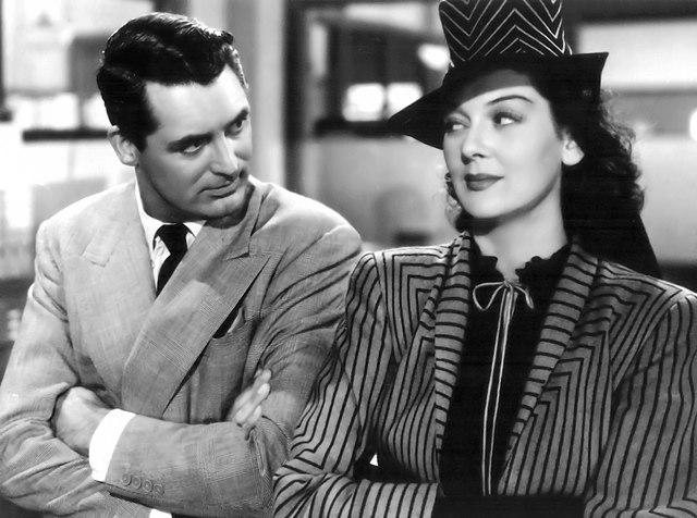
Illustrations: Cary Grant and Rosalind Russell as temporarily divorced newspapermen in His Girl Friday (1944).
Wendy M. Grossman is the 2013 winner of the Enigma Award. Her Web site has an extensive archive of her books, articles, and music, and an archive of earlier columns in this series. She is a contributing editor for the Plutopia News Network podcast. Follow on Mastodon.
